Editorial system · Campaign
Field Notes
A visual language for noticing the details that shape a place.

The challenge
Make the
ordinary vivid.
Field Notes began as a small editorial series about material, craft, and everyday observation. The project had a strong voice, but no consistent visual world to connect each issue, photograph, and event.
We set out to create an identity that felt collected rather than constructed — a system with room for texture, surprise, and the marks of the people who use it.
Our approach
Process is
part of the story.
The identity is built from a set of simple gestures: hand-drawn forms, flexible grids, and an intentionally tactile relationship between image and type. Instead of hiding the process, the system makes it visible — turning each edition into a new composition within a recognizable family.
Start a similar project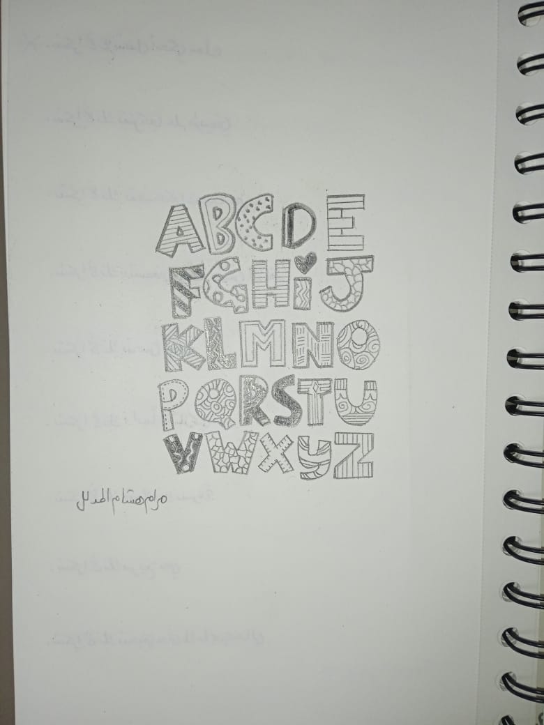
The outcome
03 / 03A recognizable rhythm
Every issue can change its surface while staying anchored to the same editorial point of view.
More ways to participate
The system invites collaborators to add their own marks, images, and interpretations to the work.
A campaign with a shelf life
The identity was built to live beyond launch, growing through new stories and new hands.